
The Enduring Coca-Cola Logo and the Subtle Design Choices Behind Its Global Recognition
A Symbol Recognized Around the World
Few brand images are as instantly recognizable as the Coca-Cola logo. For generations, it has appeared on storefronts, beverage containers, advertisements, vending machines, restaurant displays, and promotional campaigns across countless countries.
Its familiarity is so deeply woven into everyday life that many people hardly stop to examine it. Yet the logo’s lasting influence is the result of carefully crafted design choices that have remained remarkably consistent for well over a century.
What makes the logo especially powerful is that it communicates its identity almost instantly. A glimpse of the distinctive script against a red background is often enough for people to identify the brand without reading a single word.
The Beginning of an Iconic Design
The origins of the Coca-Cola logo date back to 1886, when Frank Mason Robinson, a bookkeeper associated with the company in its early years, selected the lettering style that would define the brand.
He chose Spencerian script, a handwriting style that was widely respected at the time for its elegance and readability. The flowing letters gave the brand a refined appearance and helped distinguish it from competitors.
During an era when written presentation played an important role in advertising and commerce, the script offered a memorable visual identity.
Rather than appearing rigid or industrial, the lettering felt personal and approachable. That quality would become one of the logo’s most enduring strengths.
The Character of Spencerian Script
Spencerian script is known for its graceful curves, flowing lines, and handwritten appearance. These characteristics gave the Coca-Cola name a distinctive personality from the very beginning.
The style conveyed a sense of craftsmanship and familiarity that resonated with consumers. Instead of looking purely commercial, the lettering suggested warmth and human connection.
This handwritten quality helped the brand create an emotional impression that extended beyond the product itself.
As Coca-Cola expanded into new markets and reached larger audiences, the script remained a constant visual anchor, helping preserve a sense of continuity and identity.
Refinements Across the Decades
Although the logo has remained recognizable throughout its history, it has undergone subtle refinements over time.
Adjustments to spacing, line thickness, proportions, and visual balance helped improve the logo’s appearance across different applications.
These updates were not dramatic redesigns. Instead, they focused on strengthening the existing identity while ensuring the logo remained effective on bottles, signs, packaging, printed advertisements, and eventually digital platforms.
By preserving its core features while making careful improvements, the brand maintained familiarity without appearing outdated.
The Importance of the Signature Red Color
The red background associated with Coca-Cola has become one of the most recognizable color choices in global branding.
Red naturally attracts attention and stands out in crowded environments. It is often associated with energy, excitement, movement, and strong emotional responses.
Within food and beverage marketing, red is frequently linked to appetite and enjoyment, making it particularly effective for consumer products.
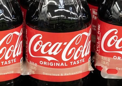
Combined with the distinctive white script, the color creates a visual identity that remains highly visible whether viewed up close or from a distance.
The consistent use of red over many decades has strengthened the connection between the color and the brand itself.
The Contrast That Creates Visibility
A major reason the logo remains effective is the strong contrast between the white lettering and the red background.
The bright script stands out clearly, making the logo easy to identify in a wide range of settings.
While the red background provides energy and visibility, the white lettering contributes a sense of clarity and simplicity.
Together, these elements create a balance between boldness and approachability.
The result is a design that captures attention while maintaining an inviting appearance.
The Concept of a Hidden Message
In recent years, discussions about the Coca-Cola logo have sometimes focused on the idea that it contains a hidden message.
Unlike logos that feature concealed symbols or visual puzzles, the Coca-Cola design does not rely on secret imagery.
Instead, many observers argue that its hidden power lies in the emotional response it generates.
The logo communicates through visual cues rather than coded messages. Its influence comes from color, shape, familiarity, and repeated exposure.
These elements work together to create impressions that people often absorb without consciously noticing them.
How Design Influences Emotion
One reason the logo has endured is its ability to build emotional associations over time.
Repeated exposure connects the design with experiences, memories, and everyday moments.
People may encounter the logo during celebrations, meals, sporting events, family gatherings, vacations, or seasonal traditions.
Over the years, these experiences become linked with the brand’s visual identity.
As a result, the logo often serves as a reminder of past experiences rather than functioning solely as a product label.
This emotional connection contributes significantly to its lasting effectiveness.
The Influence of Familiarity
Familiarity is one of the strongest forces in branding, and Coca-Cola has benefited from consistent visibility for generations.
The logo has appeared repeatedly in both public and private settings, helping establish a sense of recognition that spans multiple age groups.
When people repeatedly encounter the same visual design, it often becomes associated with reliability and comfort.
That familiarity can strengthen trust and make a brand feel established and dependable.
For many consumers, recognition occurs almost automatically, without conscious analysis of the logo itself.
A Brand Symbol Beyond the Beverage
As Coca-Cola expanded internationally, its logo evolved into something larger than a marker for a soft drink.
It became associated with broader themes such as nostalgia, celebration, community, and shared experiences.
The logo could be found in countless environments, from small neighborhood businesses to major international events.
Regardless of location, the visual identity remained largely unchanged, helping maintain consistency across different cultures and markets.
This adaptability allowed the logo to become one of the most recognizable symbols in the world.
The Strength of Consistency
Many companies frequently redesign their visual identities in an effort to remain modern. Coca-Cola has largely followed a different path.
Rather than abandoning its historic appearance, the company has preserved the essential elements that made the logo successful.
This consistency has allowed generations of consumers to recognize the brand instantly.
People who first encountered the logo decades ago can still identify it today, while younger audiences continue to become familiar with the same visual design.
The continuity creates a sense of stability that few brands achieve.
Why the Flowing Curves Matter
The script’s curved lettering contributes significantly to the logo’s personality.
Unlike sharp or heavily geometric designs, the flowing lines create a softer and more welcoming impression.
The letters appear connected and fluid, guiding the viewer’s eye naturally across the wordmark.
This smooth movement helps make the design memorable and visually pleasing.
The curves also balance the intensity of the red background, ensuring the overall appearance remains approachable rather than overwhelming.
The Real Secret Behind the Logo’s Success
The lasting influence of the Coca-Cola logo may not come from any hidden symbol at all.
Its strength lies in a combination of simplicity, consistency, emotional resonance, and visual recognition.
The design succeeds because it is easy to remember and capable of creating positive associations over time.
Rather than relying on complex imagery, it communicates through repeated exposure and familiar visual cues.
Those qualities allow the logo to remain effective even in an environment filled with competing messages and advertisements.
A Visual Identity That Communicates Without Words
Although the Coca-Cola name is clearly written within the logo, much of its impact comes from elements that extend beyond the text itself.
Color, shape, rhythm, and familiarity all contribute to the way people respond to the design.
The logo is capable of conveying emotion and recognition even when it appears without additional slogans or messaging.
Its visual language is powerful enough to cross cultural and linguistic boundaries.
That ability has helped make it one of the most enduring examples of successful branding.
Why It Continues to Resonate Today
The Coca-Cola logo remains effective because it combines historical continuity with ongoing visibility.
Its design feels familiar to older generations while remaining relevant to younger audiences.
The red background commands attention, while the white script provides warmth and familiarity.
Together, these elements have allowed the logo to adapt to changing media, evolving technologies, and shifting consumer habits without losing its identity.
Its success demonstrates that strong design does not always require dramatic change. Sometimes consistency itself becomes a source of strength.
A Lasting Lesson in Branding
The story of the Coca-Cola logo illustrates how thoughtful design can create a lasting connection with people across generations.
What began as a practical choice in 1886 evolved into one of the most recognizable visual identities ever created.
The flowing Spencerian script provided character and elegance. The red background supplied energy and visibility. Together, they formed a design that remains deeply embedded in public memory.
Its influence does not depend on hidden symbols or secret meanings. Instead, it relies on familiarity, emotion, and consistent presentation.
More than a century after its creation, the logo continues to demonstrate how powerful a simple and carefully maintained design can become.

