
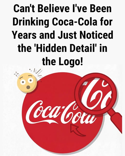
The Hidden Detail in the Coca-Cola Logo That Has Captivated Viewers Worldwide
Few brand symbols are as instantly recognizable as the flowing white script set against a bold red background associated with Coca-Cola. For well over a century, this logo has appeared in nearly every corner of the world, from small local shops to large urban billboards. Its presence has become deeply woven into everyday life, representing not only a beverage but also a broader cultural identity shaped through decades of marketing and familiarity.
In recent years, renewed curiosity has emerged around a subtle visual detail within the logo. What was once seen purely as elegant lettering is now being examined from a different perspective. This shift has sparked widespread discussion, especially online, where viewers share observations and interpretations that reshape how the design is understood.
The focus of this attention lies within the second word of the brand name. Specifically, many people have begun noticing the curved form of the letter “C” in “Cola.” The lower arc of this letter appears to rise upward in a way that resembles a human smile. Once this resemblance is pointed out, it becomes difficult for some viewers to ignore, transforming their perception of the logo.
This interpretation changes the experience of viewing the design. Instead of simply reading a brand name, individuals begin to perceive a subtle emotional expression embedded within the lettering. The flowing curves take on a new meaning, suggesting warmth and friendliness. As a result, the logo feels less static and more engaging, as though it is communicating directly with the viewer.
The discovery has led to ongoing debate about whether this effect was intentional. Some believe it reflects a sophisticated branding decision, suggesting that even early designers understood how subtle visual cues could influence emotional responses. Others argue that the resemblance is purely coincidental, shaped more by modern interpretation than by original design intent.
To better understand this question, it is helpful to look at the origins of the logo. The design was created in the late nineteenth century by Frank Mason Robinson, who worked alongside John Stith Pemberton. Robinson chose a writing style known as Spencerian script, which was widely used at the time for its clarity and visual elegance.
His goal was straightforward: to create a name that looked distinctive, balanced, and easy to read. The repetition of the letter “C” contributed to the visual harmony of the design, giving it a smooth and recognizable rhythm. Historical records and early sketches indicate that the focus was on aesthetic appeal rather than hidden symbolism.
There is no documented evidence suggesting that Robinson intended to embed a smile or any other concealed image within the lettering. At the time, design practices did not typically involve hidden visual messages or layered interpretations. Instead, the emphasis was on legibility and refinement, consistent with the standards of the period.
From a historical standpoint, the perceived smile is likely unintentional. However, this does not diminish its impact. The reason so many people can see this feature lies in how the human brain processes visual information.
A key concept that explains this phenomenon is Pareidolia. This refers to the brain’s natural tendency to recognize familiar patterns, particularly faces, in abstract shapes. It is the same process that allows people to see images in clouds or identify faces in everyday objects.
Humans are especially attuned to facial expressions, as they play a crucial role in communication and social interaction. Even simple curves or arrangements can trigger the perception of a face or an emotion. In the case of the Coca-Cola logo, the upward curve of the letter closely resembles the shape of a smile, making the association almost automatic once noticed.
This interpretation is further reinforced by the brand’s long-standing messaging. Coca-Cola has consistently positioned itself around themes of happiness, connection, and shared experiences. Over decades, advertisements and campaigns have emphasized positive emotions, creating strong associations in the minds of consumers.
Because of this, viewers are already primed to expect a sense of warmth and enjoyment when they see the logo. When the brain encounters a shape that resembles a smile, it aligns naturally with these existing associations. The result is a powerful interaction between visual form and psychological expectation.
This interplay highlights an important aspect of perception: meaning is not solely determined by the design itself, but also by the observer. The viewer actively participates in constructing the interpretation, influenced by memory, emotion, and context.
In this sense, the perceived smile can be understood as a collaborative effect. The original design provides the structure, while the viewer’s mind completes the image. This dynamic illustrates how visual communication evolves over time, gaining new layers of meaning beyond its initial purpose.
The Coca-Cola logo is a strong example of how enduring designs can adapt to changing perspectives. What began as a piece of elegant calligraphy has developed into a symbol rich with interpretation. Its simplicity allows it to remain relevant, while its familiarity encourages ongoing engagement.
The appeal of discovering hidden details also plays a role in its continued popularity. In a world where information is constantly consumed, moments of unexpected recognition can feel particularly engaging. Noticing something previously overlooked creates a sense of personal connection, making the experience more memorable.
For many people, seeing the “smile” within the logo changes how they view it going forward. The design becomes more than just a brand identifier; it takes on an expressive quality that feels intentional, even if it was not originally designed that way. This shift demonstrates how perception can reshape reality, adding meaning where none was explicitly intended.
Ultimately, the story of the Coca-Cola logo reflects a combination of historical design and modern interpretation. While the original creator likely focused on aesthetics and readability, the evolving perspective of viewers has introduced new dimensions to the image.
The logo’s lasting impact lies in its ability to connect with audiences across generations. Whether seen as simple lettering or as a subtle expression, it continues to capture attention and inspire curiosity.
What people notice often depends on how they look. A familiar image can reveal something new when viewed from a different angle or with a different mindset. This highlights the role of perception in shaping experience.
In the end, the hidden detail is less about what was intentionally placed in the design and more about how the human mind interprets it. The curves of the logo remain the same, but the meaning can change depending on the observer.
This enduring flexibility is one of the reasons the Coca-Cola logo remains so powerful. It continues to invite attention, spark discussion, and evolve in meaning, proving that even the most familiar symbols can still offer something new to discover.
